Saying Goodbye: Hobonichi and Nolty Planners
Although I started in the world of Japanese planners with Hobonichis, I realised the way I journal has changed over the years. The Hobonichi Weeks’ layout is flexible but I find the overall size and grid a bit too cramped. The Hobonichi A6 Daily is not something that appeals to me any more as I prefer a weekly layout now; and the A5 Cousin is too bulky to carry around and the vertical 24 hour layout hasn’t worked out for me.
Nolty planners, on the other hand, has been satisfying my needs in the last few years with considerably more layout options to choose from. I enjoyed the Nolty 2281 thoroughly (you can read my review of the Nolty 2281 here), but I do have a few things I did not like about it:
- Paper was a bit too yellow for my preference
- Grid markings on weekly spread (3mm) is a bit too small for my handwriting
- The left (narrow) column in the monthly view doesn’t allow for much use – too small for me to log anything reasonable
- Having a monthly mini calendar on every weekly spread feels like a waste of space
Trying out MARK’s Planners and Diaries
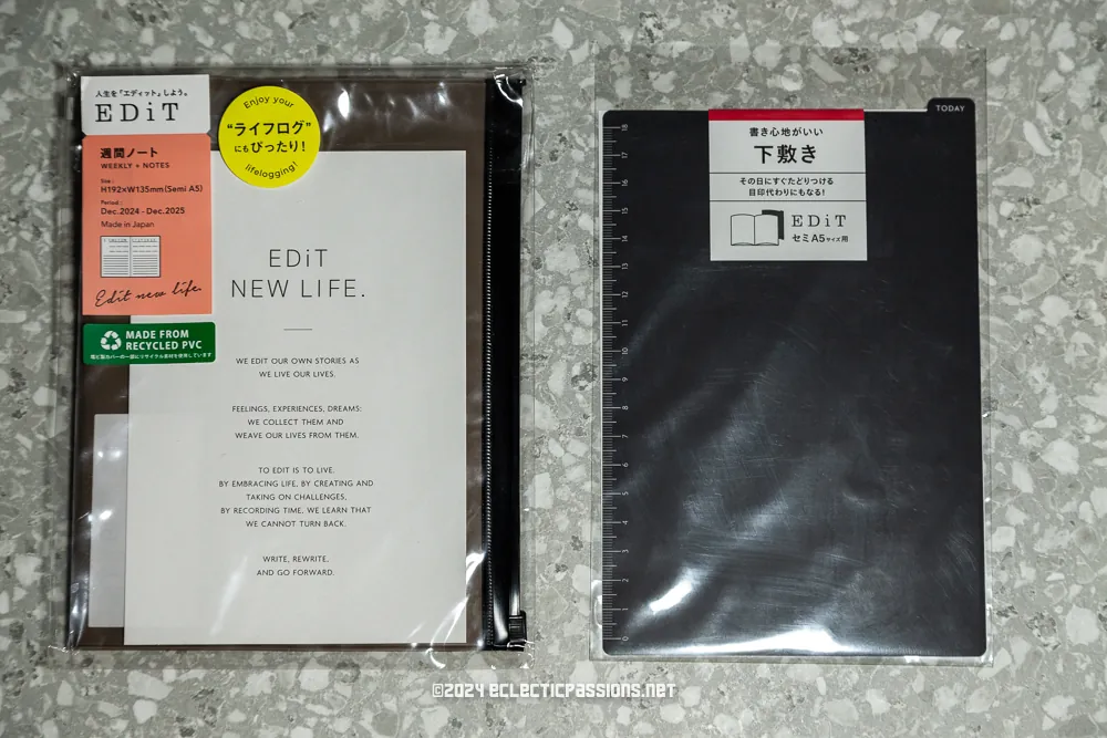
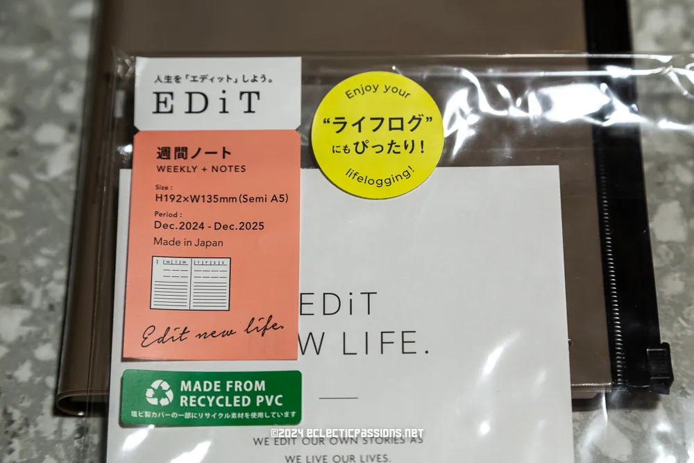
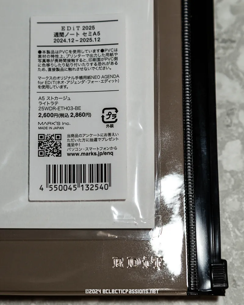
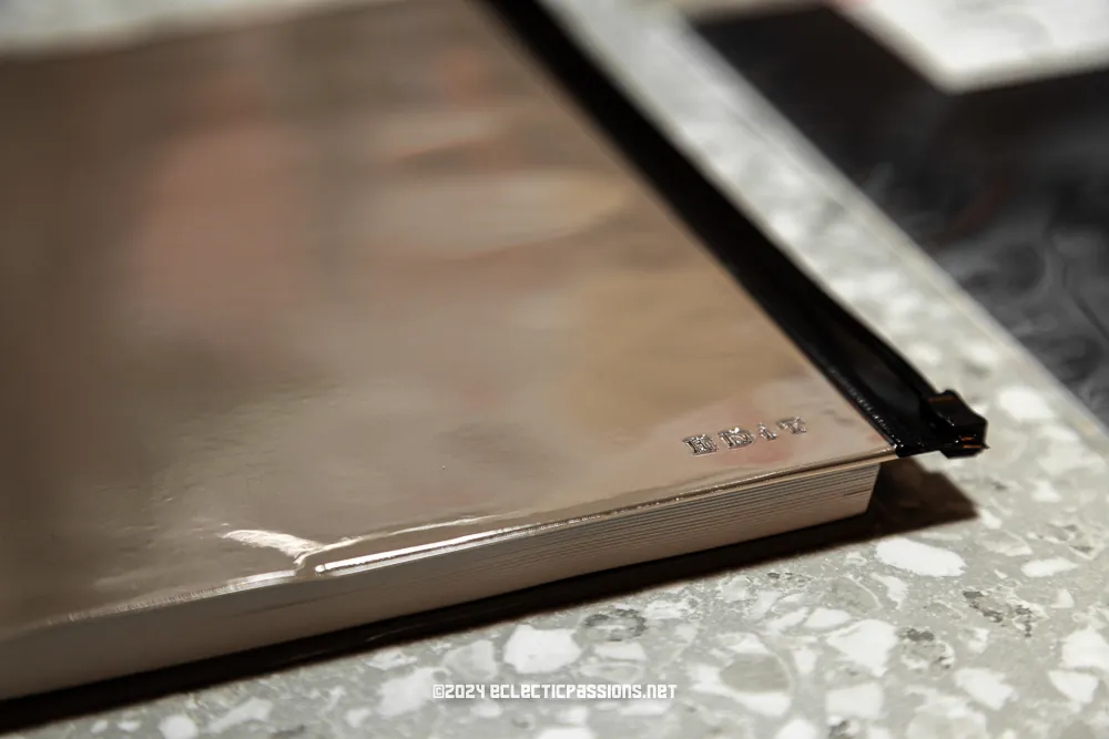
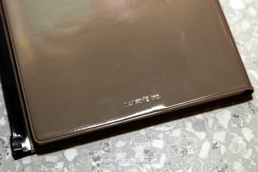
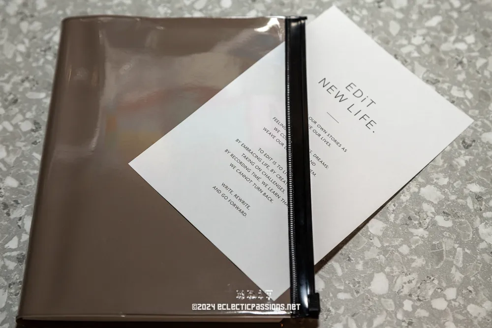
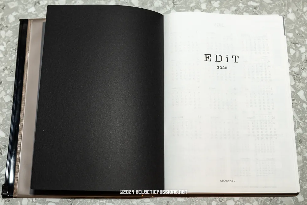
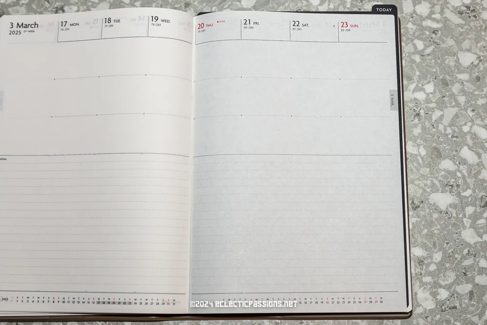
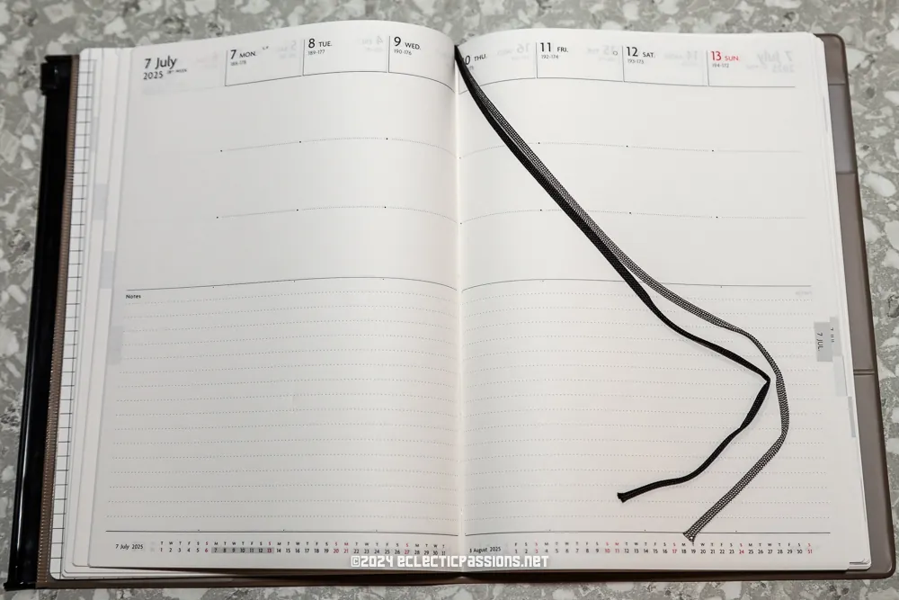
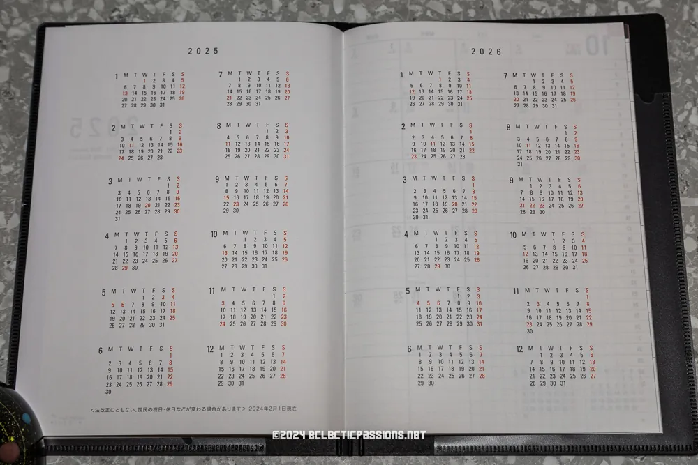
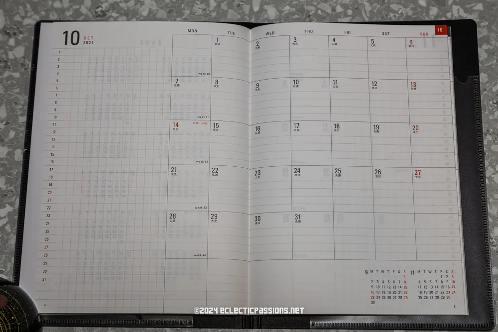
After searching around for a similar layout to 2281 in the Japanese planner world, I found a relatively uncommon / not much documented (in English) layout by MARK’s. The model I bought for 2025 is called “EDiT planner 2025 – Schedule Book Starting December 2024 – Weekly Note Semi-A5 Stockage” with a Monday-start, “3-section vertical type” weekly layout. (Product code: 25WDR-ETH03).
I managed to find and decide this was the planner to get for next year just as I was heading to Osaka for a holiday (with the Asia Miles I’ve been earning)! I emailed Mark’s directly to see which branch of stationery shop like Loft or Hands would stock this particular model. A sales representative called Kurano San replied very swiftly (in English) about the only one(!) branch that stocked it in Osaka. I managed to buy it on the first day and there were only three in stock…
MARK’s EDiT: Content / Layout Showcase
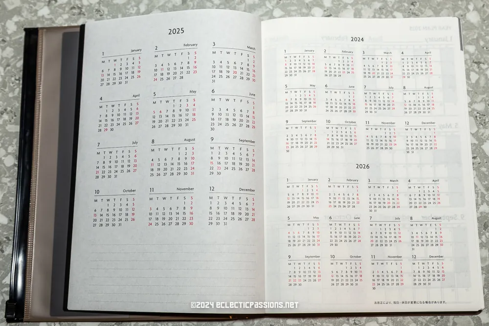

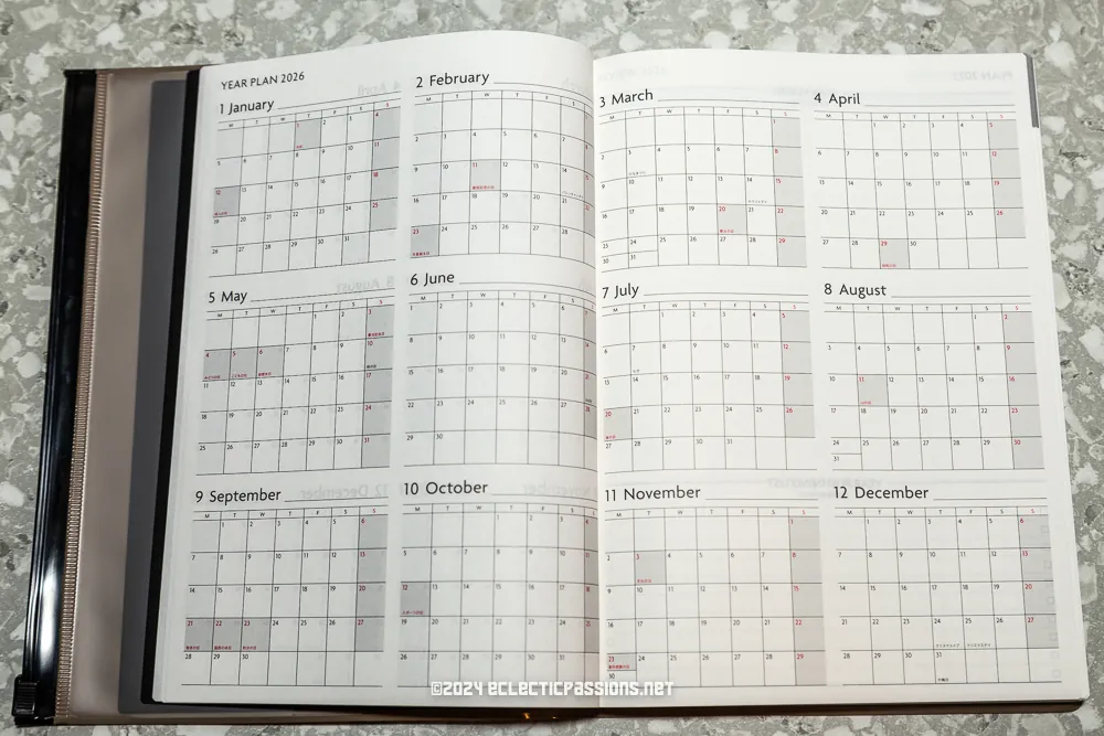
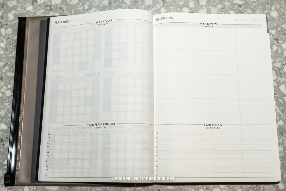
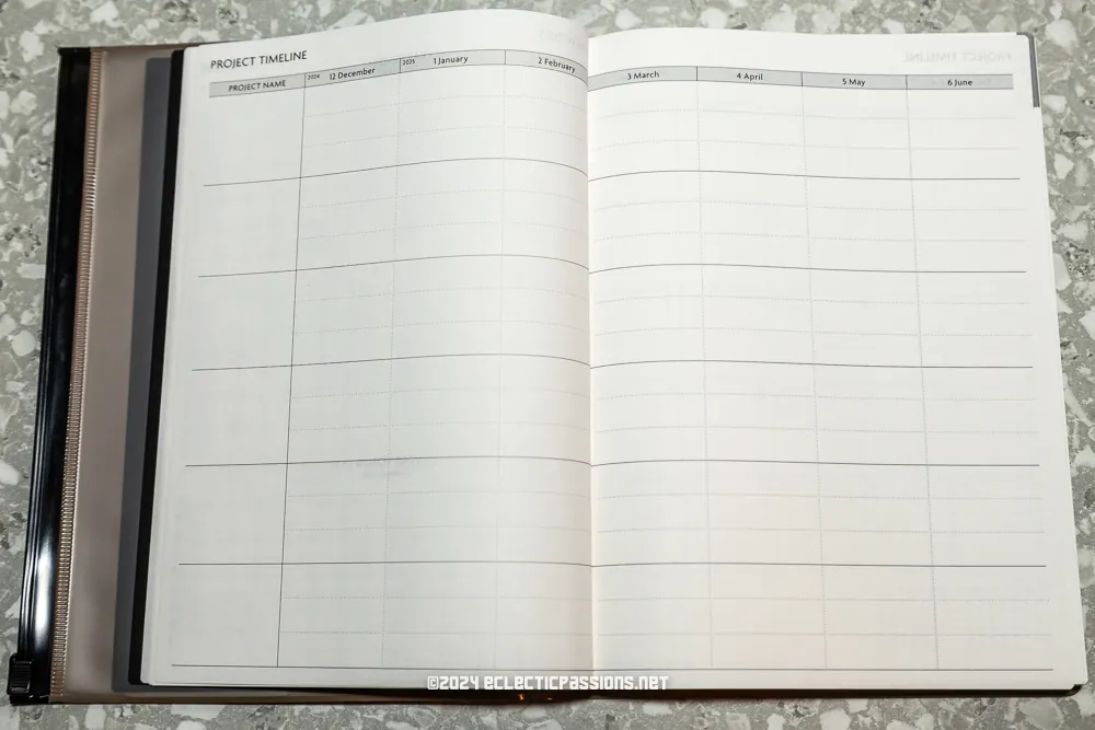
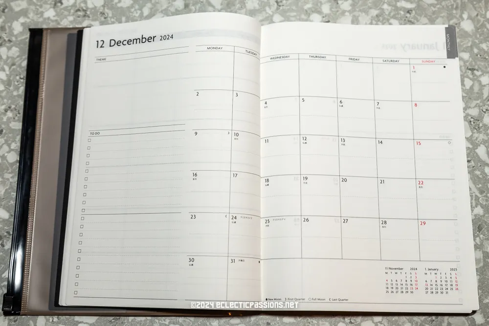
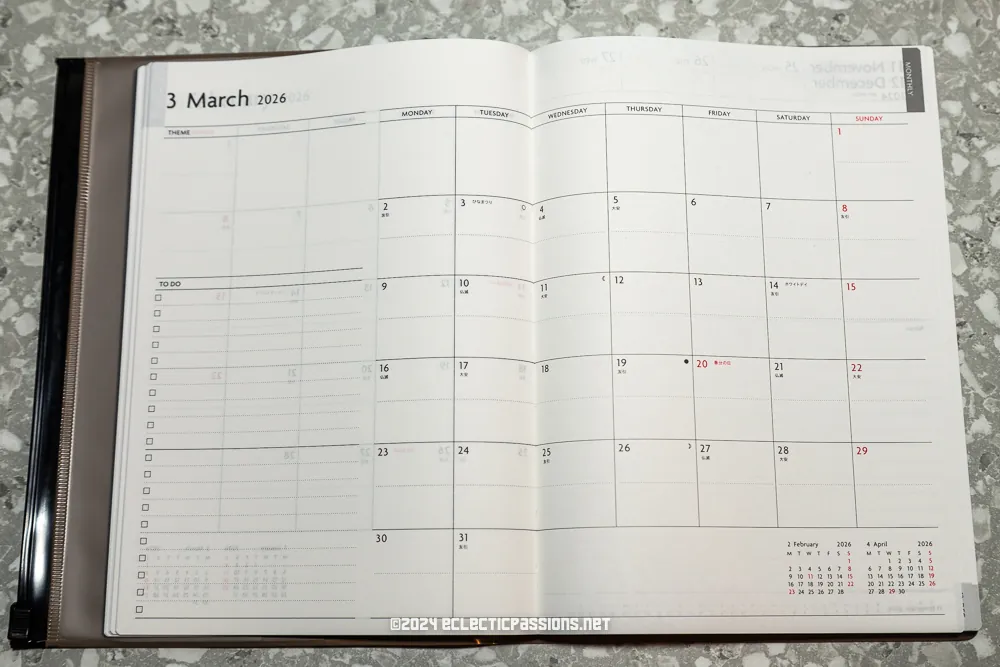
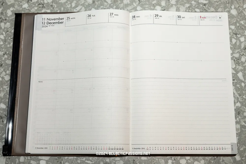
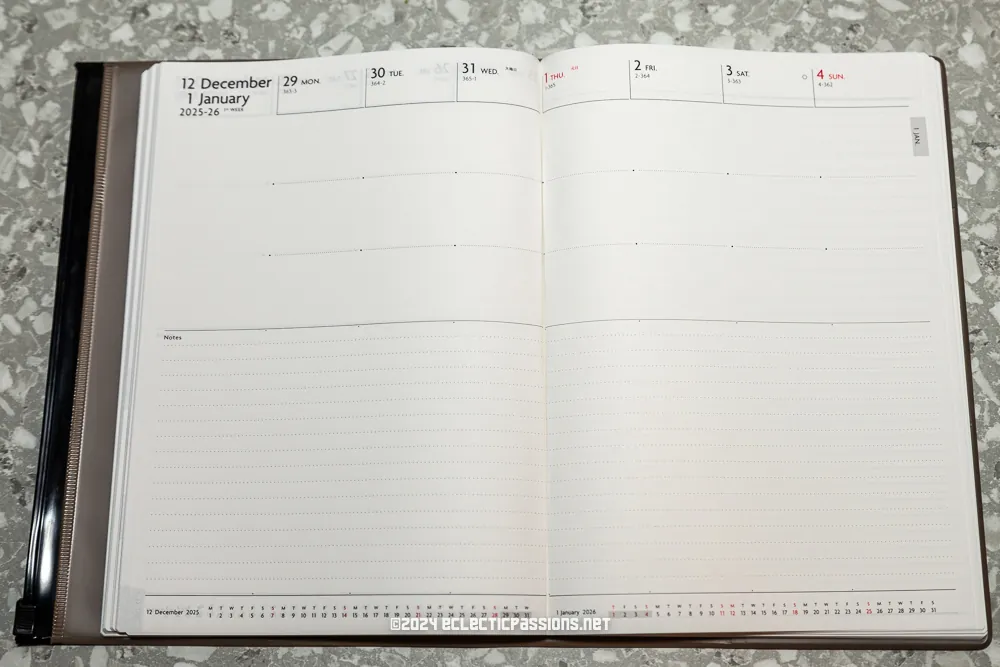
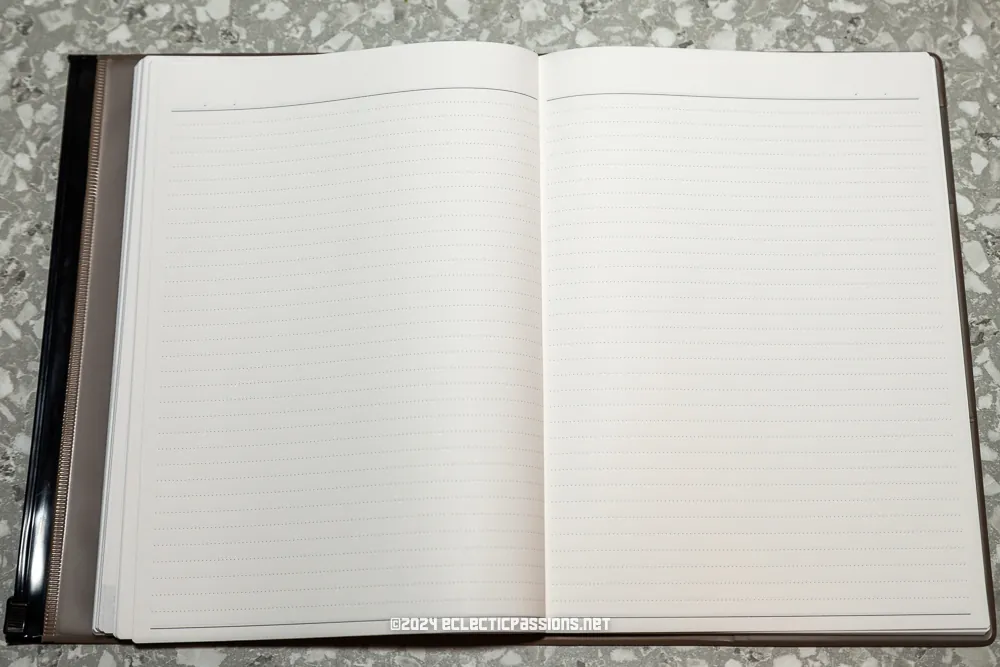
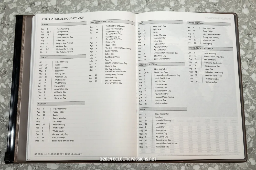
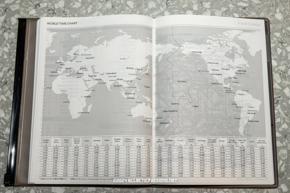
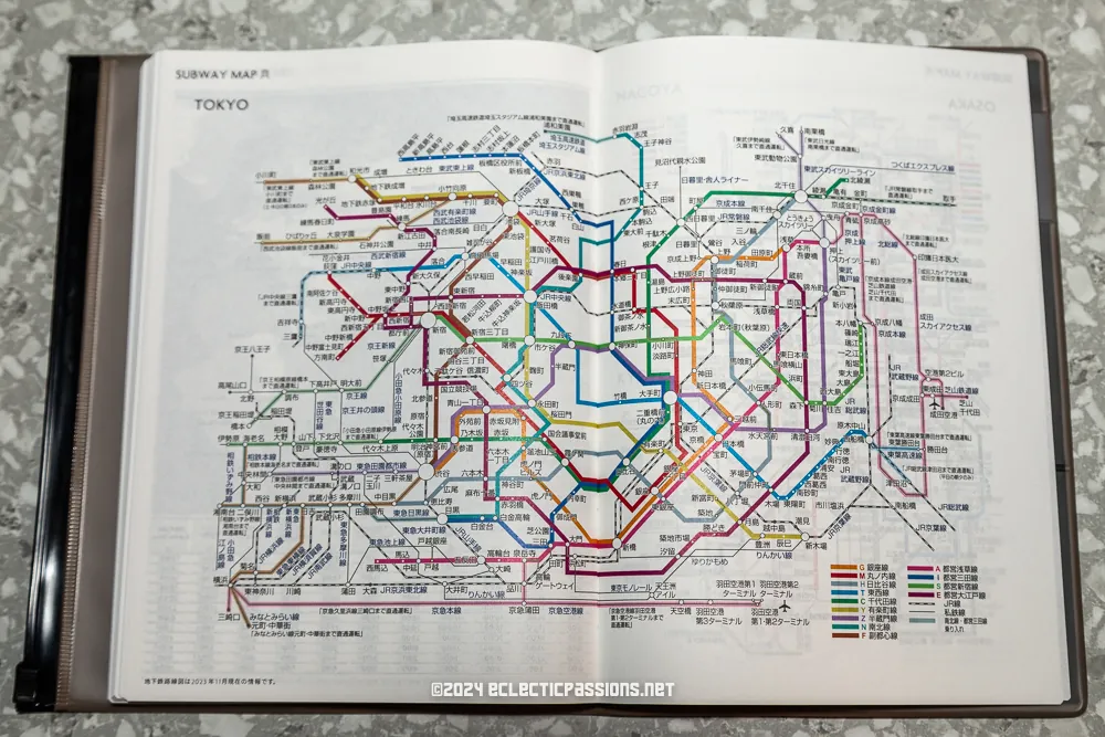
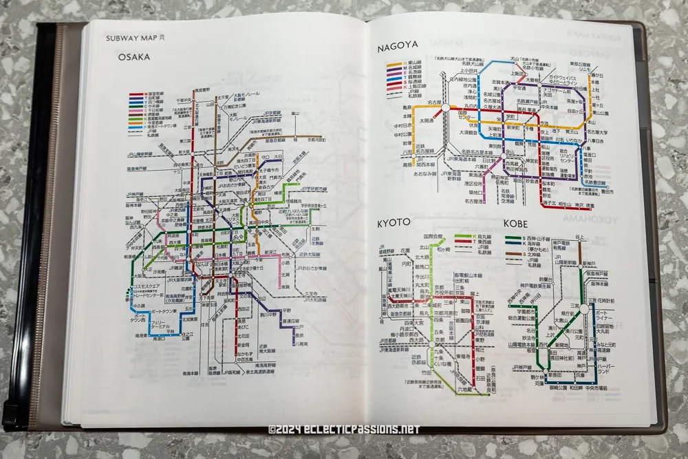
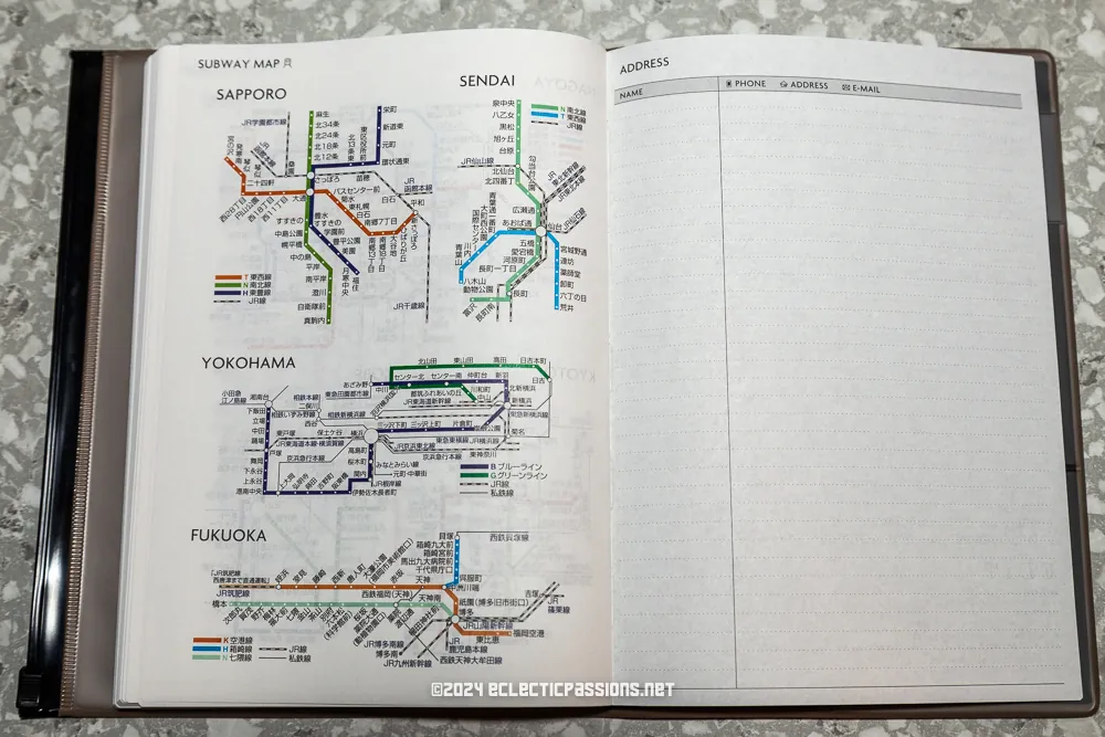
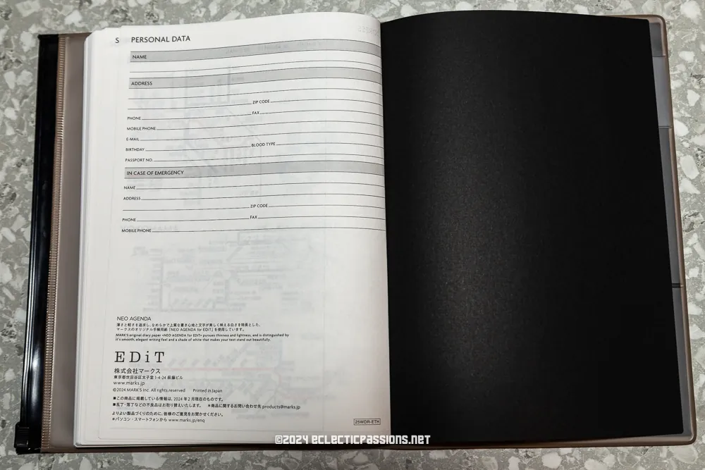

Deciding Factors
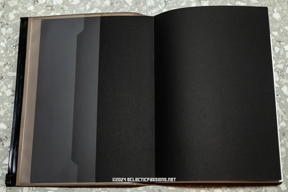
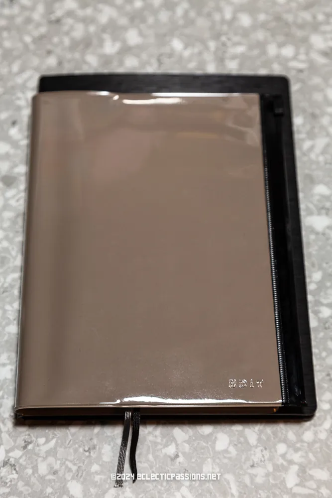
I feel other brands like Takahashi, Nolty, Midori, Hobonichi, and Kokuyo Jibun were more prominent while I was in Japanese shops that sold planners. But this did not put me off MARK’s as I really liked the layout offered and the pocket built into the PVC cover. Having done some pen tests after opening it; I’m pleased to say also the paper quality is good enough for my fountain pen use. None of my pens, including an BB architect nib with Sailor Kiwa Guro, showed any signs of bleed-through or feathering. The Japanese paper is smooth to the touch and is thinner than their European counterparts as usual.
| Mark’s EDiT Planner Semi A5 Weekly Note | Nolty 2281 |
| 300 g with cover | 250 g with cover |
| Semi-A5 (200 x 155 x 15 mm) | B6 (188 x 133 x 15 mm) |
| Weekly spread w/ half page daily columns split into three sections | Weekly spread w/ half page daily columns split into two sections |
| Whiter paper | Yellow tinged paper |
| Rows are 5 mm tall | Grid is 3mm |
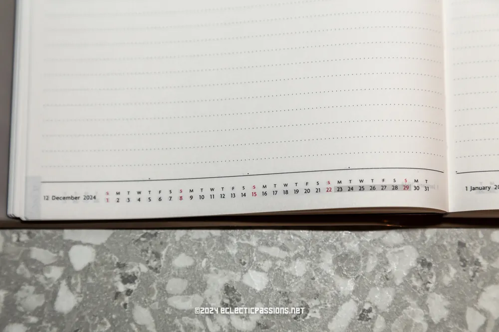
| Monthly calendar represented as a timeline on the bottom of the weekly spreads | Monthly calendar on the left corner of weekly spreads |
MARK’s EDiT: The Details
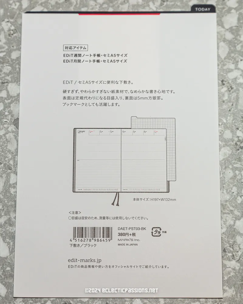
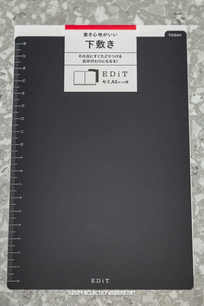
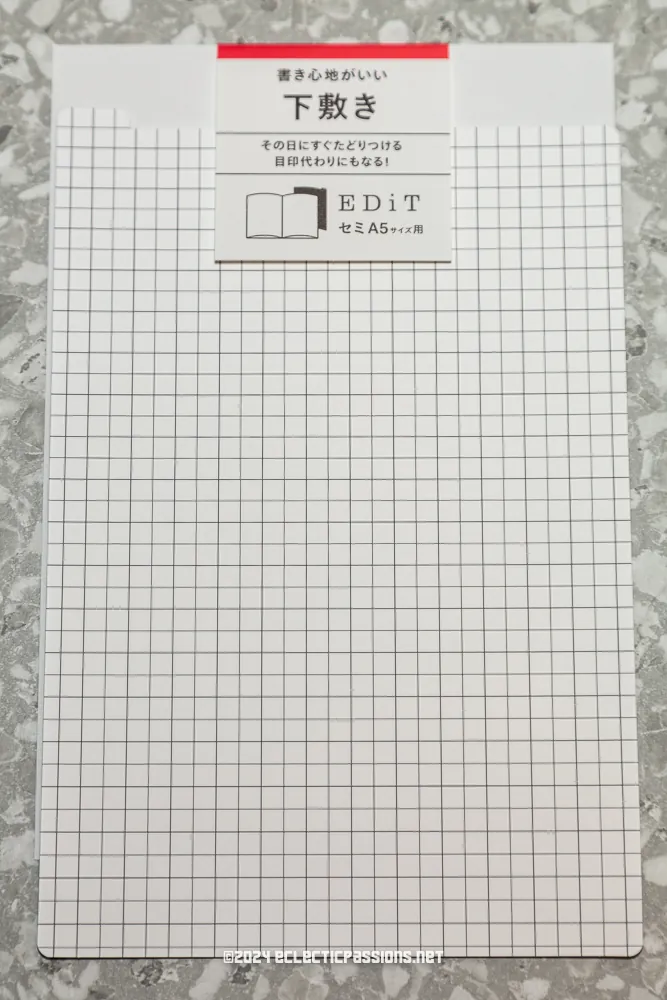
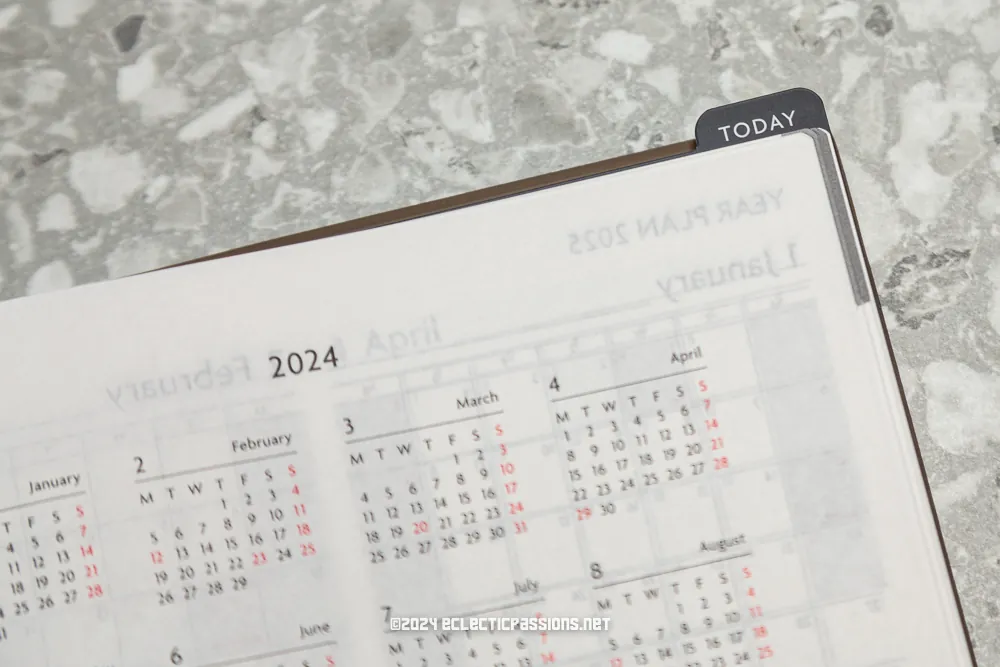
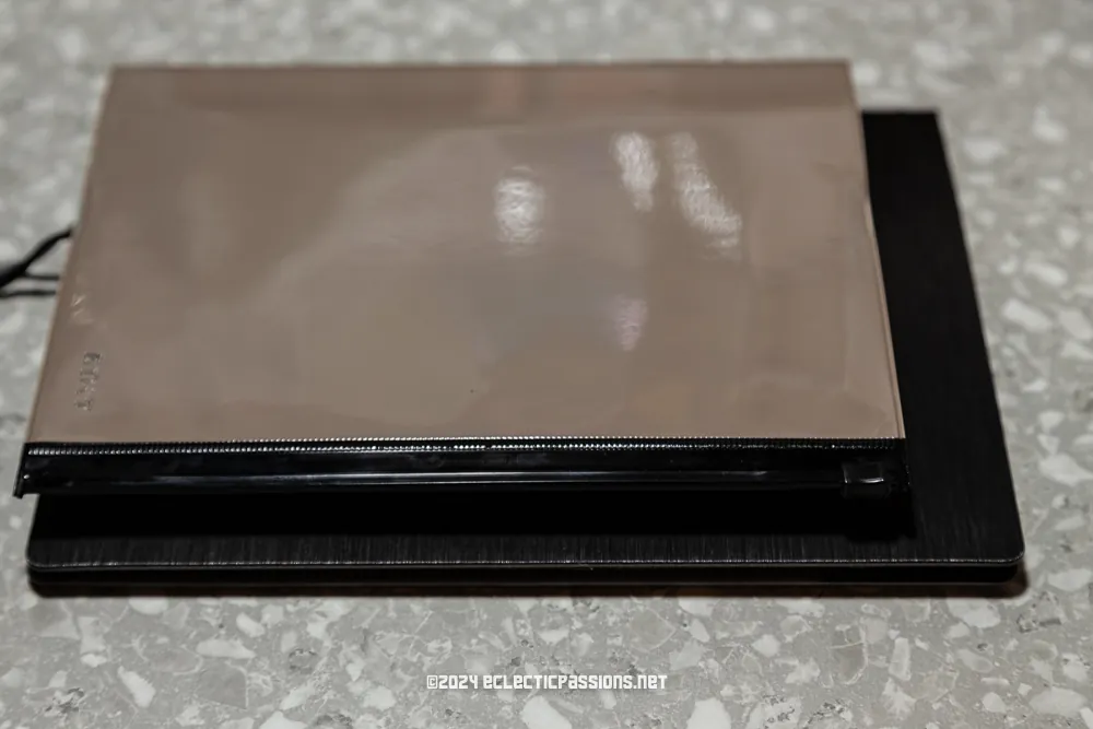
I bought a shitajiki (pencil board) to match the slightly off size A5 perfectly. I do love a dark coloured shitajiki because it helps hide any show-through due to the thinness of the paper. There’s two included fabric bookmarks which I have reinforced at the bottom with some Elmer’s glue to prevent fraying. Lastly, I do love the timeline view of the month with the current week highlighted at the bottom of the weekly spreads. It’s nice to see it in a linear fashion.
Secondary Notebooks / Planner in My Setup
Hands Gantt chart notebook
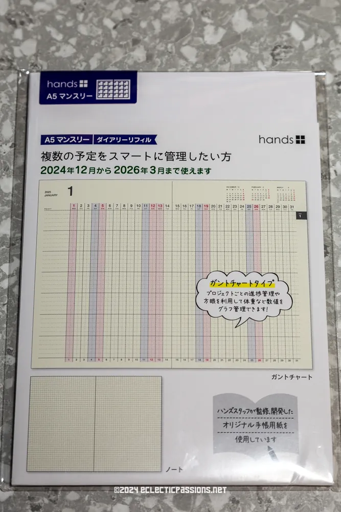
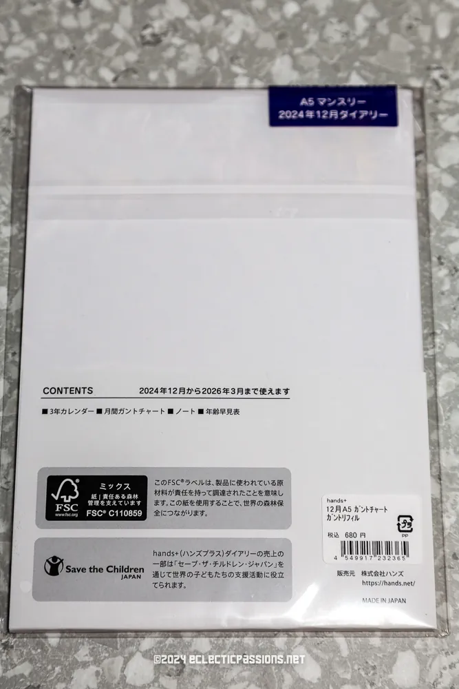
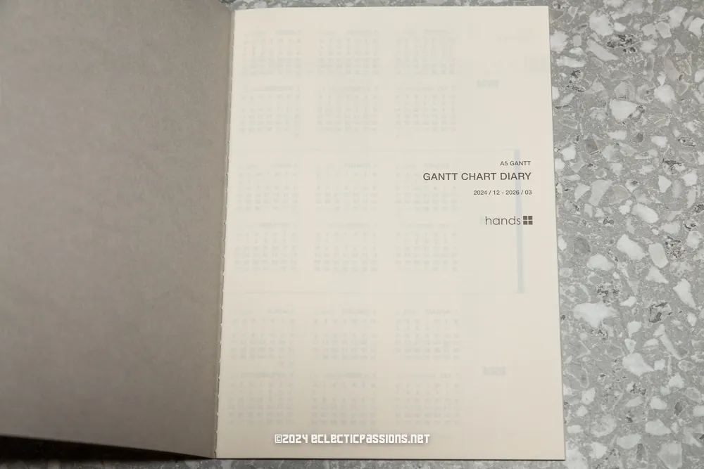
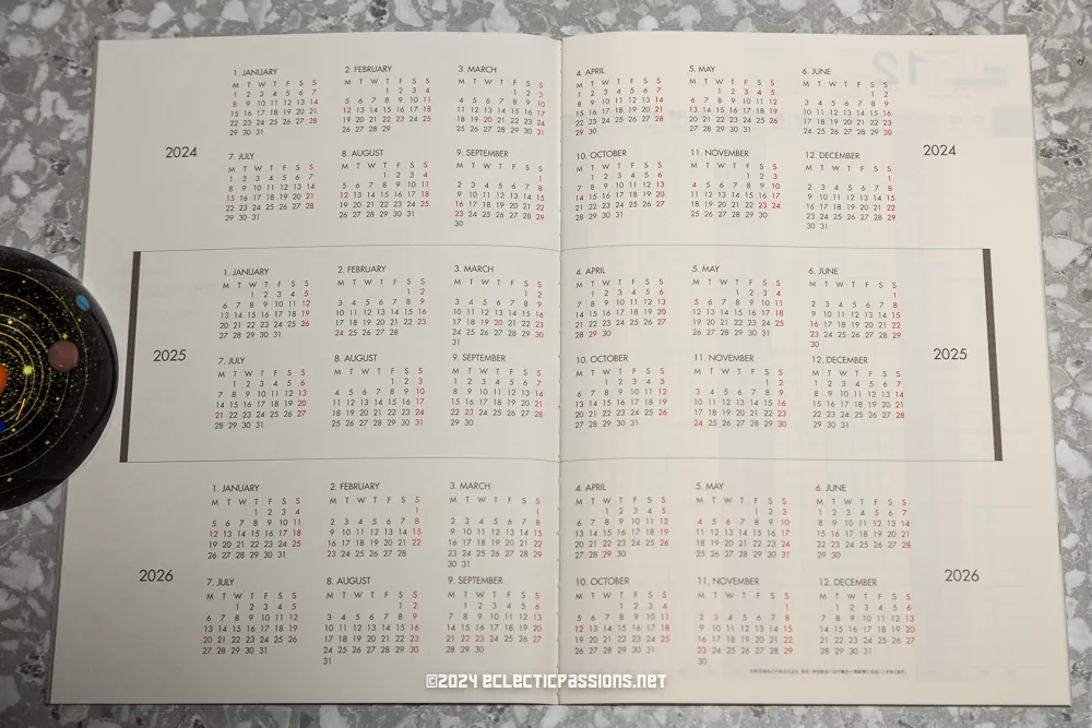
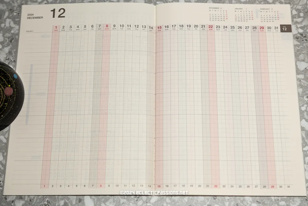
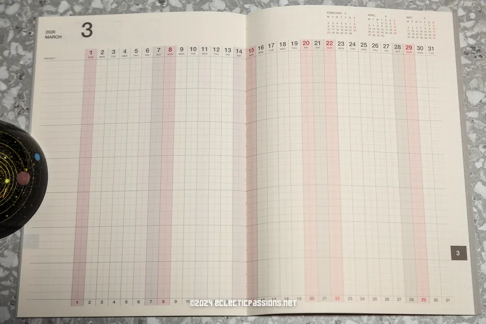
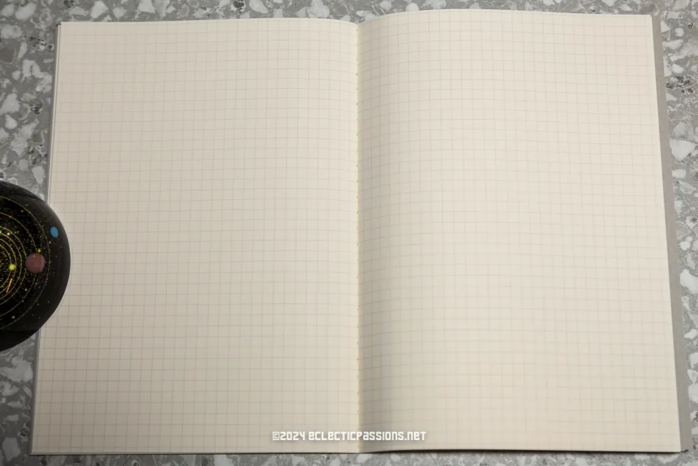
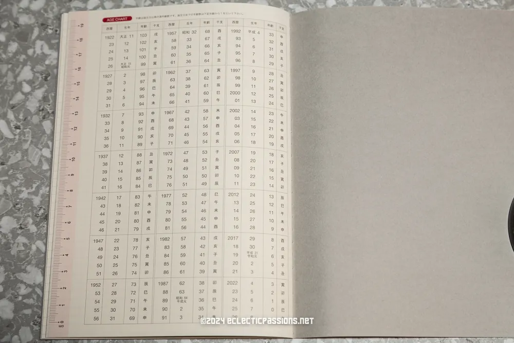
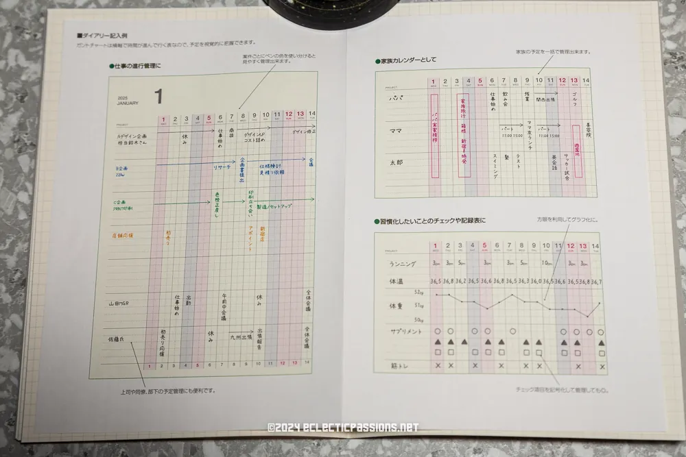
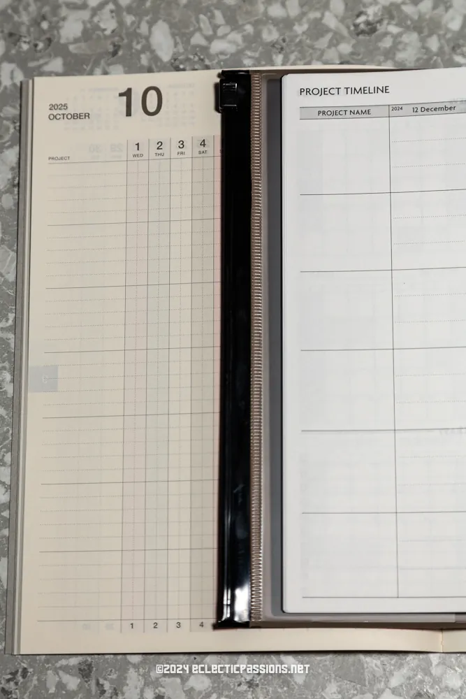
While I was at Hands (Shinsaibashi Parco Branch), I noticed they offered their own in-house Gantt Chart notebooks. I have always wanted to try tracking side projects with one and was seriously considering getting the Jibun Techo just because it offered it in the monthly pages. The notebook is very minimal and has a plain card type cover. The paper is quite yellow as you can see when compared to the MARK’s EDiT.
Midori Flat Diary
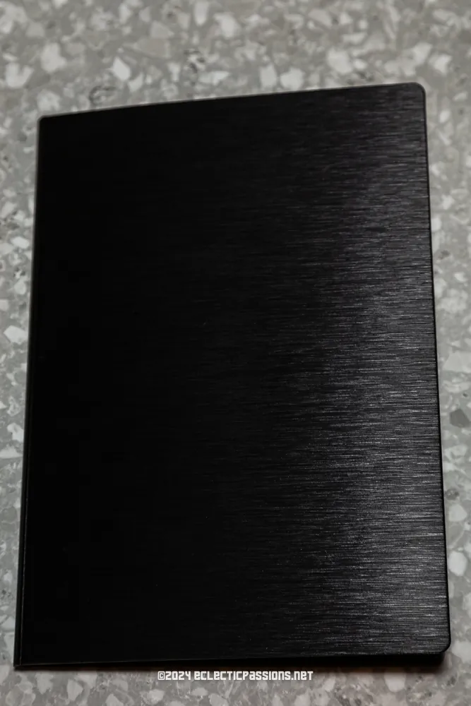
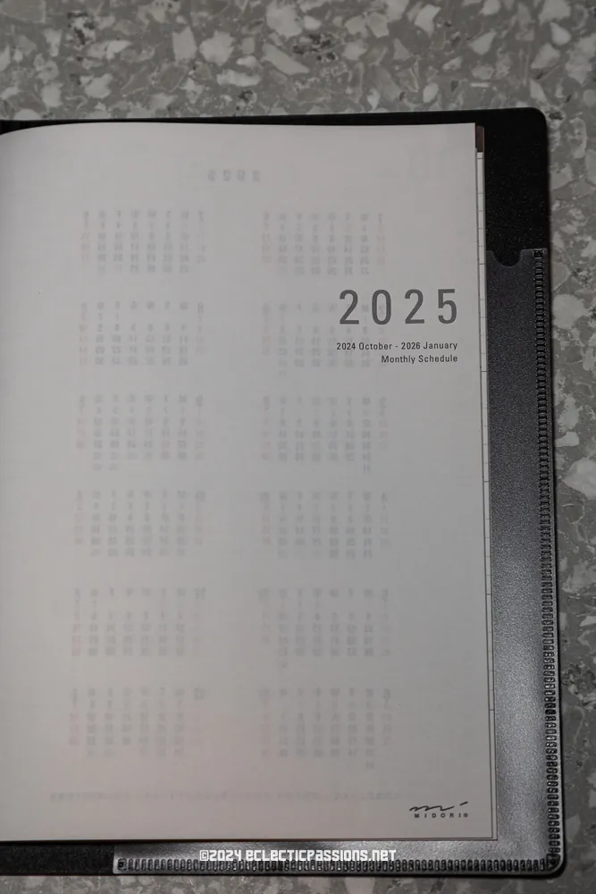
The last planner in my 2025’s setup is the Midori Flat Diary. It has a really sturdy cover which I’ve retained for the last two years. The refill is very thin and has only a monthly view with nothing extra. I look forward to using the Hands Gantt Chart Notebook in conjunction with the Midori Flat Diary which I use exclusively for health tracking. The Hands Gantt Chart fits into the Midori Flat Diary hard cover so it makes it quite streamlined along with the MARK’s EDiT!

Disclaimer: Not sponsored by any of the mentioned brands. I’m just a planner user sharing my experience. YMMV.

